The new Google+
Some of you may know that i aslo have a Google+ profile to share my images. Last week the new Google+ was rolled out..
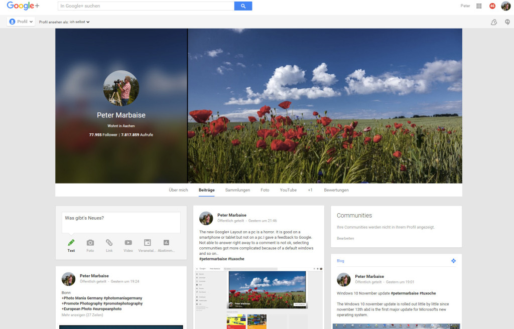
I’m not only sharing my pictures but also my blog articles on Google+ of course This looks like in my profile.
On a laptop or desktop pc using Google chrome brwoser this looks well arranged too me. Dependig on the monitor size a 3-column display supports this.
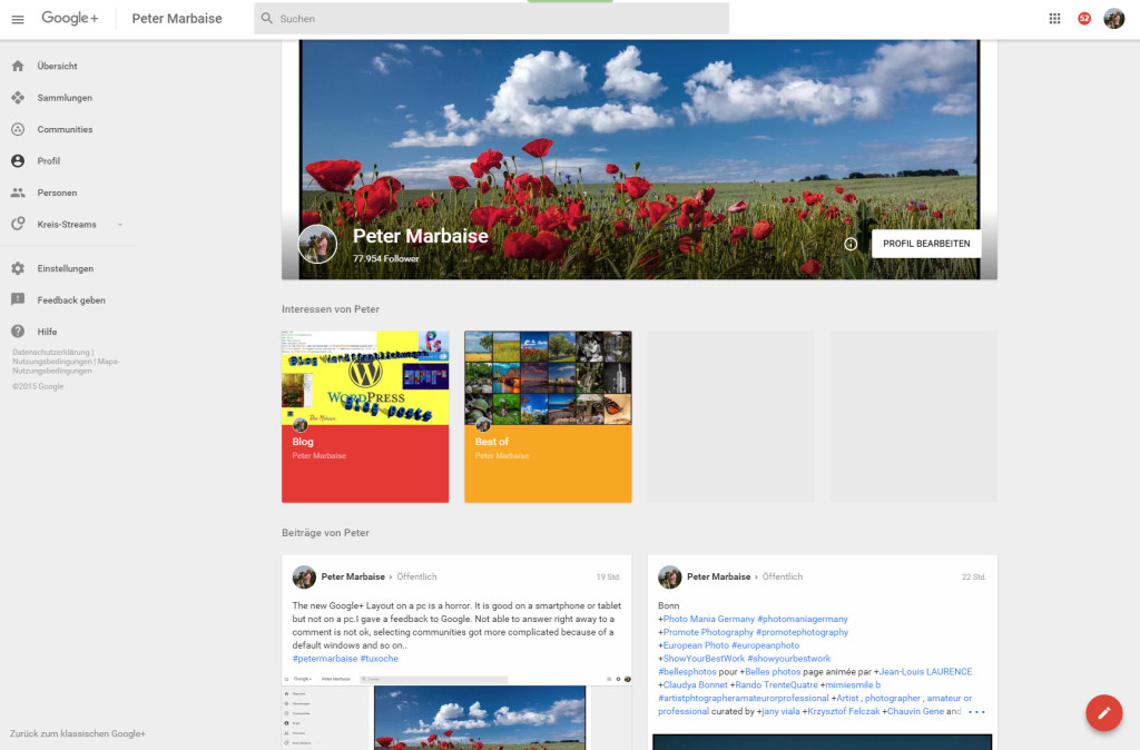
With sappy slogans like “verything is getting better and faster” Google rolled out a new design last week, which is supposed to support collections, which were introduced a couple of months ago, and communities much better.
The design offers 2-columns only and my own collections are displayed in the upper row with their title image. This is definitly not well arranged in my opinion. (Excuse the german screen shots but even choosing englisch as a system language on Windows 10, Chrome displays my profile in german) Til know there is an option to return to the old Google+ design, but just like Google+ photos i fear that after a short period of time Google will force us into the new design. An indication for this is the missing option on a Google brwoser on Android operating system.
 Even sticking with the old Google+ design, there are other restrictions. Til now you could reply to a comment, as you can on the screenshot. Clicking on “Reply” would result into inserting the user name into the reply field, which is usefull replying to comments not from the original poster. In the new Google+ design this option vanished.
After disableling circle sharing a couple of months ago, which was extremly usefull with well curated circles to get interesting other photographers or bloggers now Google+ disabled the option t share a post with the public and add a reciepient circle. This would restrict the usefulness of tools like Circloscope .
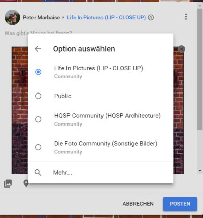
 But even Google photos experienced more restrictions. I manage my images in different collections. In the old version you could copy an image from to another collections. This doesn’t work any more since the last update. Now there is another annoyance sharing your images in form of an additional dialog. You first have to decide to share your image to the public or a commuinity. In this dialog there is a sort of choice from your last shares displayed which is not usefull at all. To choose other communities i always have to choose the “more” option 🙁
 And important for the photographers, disableing the checkbox which shouldn’t allow users to download your images is silently ignored, both in the old and the new Google+ version. The question is it is a bug or probably intention?
All in all a worsening in handling Google+. But in spite of Adobe, which learned from the criticism and rolled back the [post id=1274]import dialog[/post] Google will probably not interested in users comments.
What do you think about the new Google+? Just let me know in the comments
ciao tuxoche


