Lightroom Mobile 3.0 changes in design only
Last night Adobe released Lightroom mobile version 3.0 .
 The public announcement of yesterday, called the mid-July update, contained both Adnroid and the iOS version of Lightroom Mobile. According to Adobe statement they changed the design of the app to make it more Android-y -;)
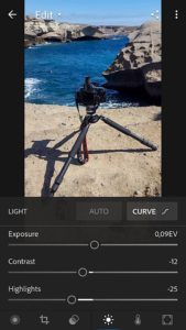
The surface is redesigned completely and all windows were revised. I like the new design a lot more and all function are running smooth. But if this leads into more effency and overall more performance i doubt it.
Even Adobe called it version 3.0, a new major version, there a no new functions implmented in the app. But the functions for image processing on a mobile devices such as a smartphone or a tablet are more than sufficient.
A list of the supported cameras can be found here.
But there is another limitations, on my smartphone i didn’t make it so with to landscape orientation with the app. Therefor i considered the new version would restrict the usage on a tablet.
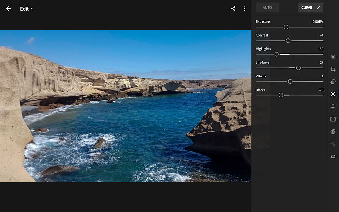
 But as you can see on this screenshot the layout for landscape orientation on a tablet is good, Adobe placed the rulers an the right side. You could discauss now, why not placing them on the bottom to give a little bit more of space to the image.
A well done optical redesign, but version 3.0 ?
ciao tuxoche


this was really useful thank you for sharing it